Creating a peaceful and inviting atmosphere in your home often starts with the colors you choose for your walls and decor. Calm colors have the power to transform any space into a soothing retreat, helping you relax and unwind. If you’re considering refreshing your home with gentle hues but aren’t sure where to begin, this blog post offers practical tips to guide you toward the perfect calm color palette.
Why Choose Calm Colors?
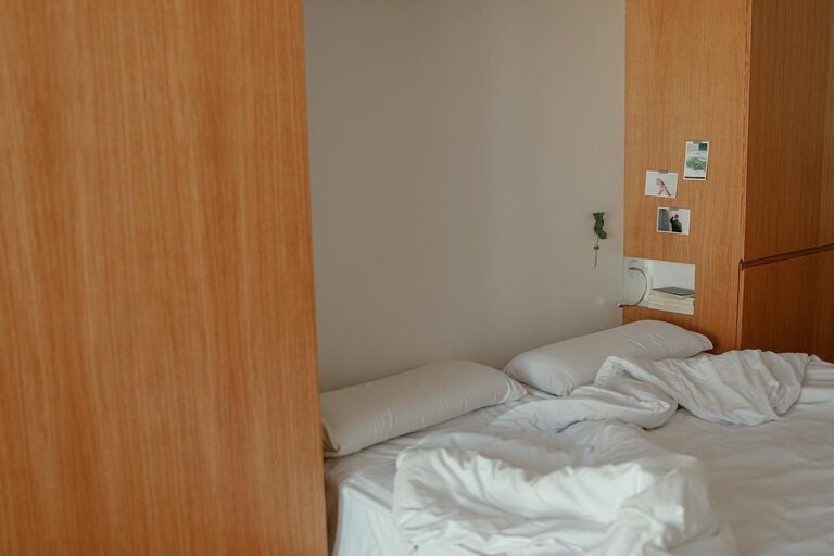
Calm colors are typically soft, muted tones that promote relaxation and reduce stress. Unlike bright or overly saturated colors, calm shades help create a balanced environment that invites comfort. These colors are perfect for living rooms, bedrooms, bathrooms, or any space designed for rest and rejuvenation.
Popular Calm Color Families
Before selecting your colors, it helps to know the types of hues that generally evoke calmness:
– Blues: Soft blues remind us of the sky and water, bringing a sense of tranquility.
– Greens: Earthy and muted greens reflect nature and growth, promoting harmony.
– Neutrals: Warm beiges, taupes, and soft grays provide a cozy and grounding backdrop.
– Lavenders and soft purples: These bring gentle sophistication without overwhelming the senses.
– Pale pinks and blush: Subtle rosy tones offer warmth and comfort, especially in bedrooms.
Tip: Test several shades within these families to find what fits best with your lighting and overall style.
Tips for Choosing Calm Colors
1. Consider the Room’s Purpose
Start by thinking about how you use the room. Bedrooms and bathrooms benefit from soft blues and greens that enhance relaxation. Living spaces might incorporate warm neutrals or muted pastels to foster social comfort without energy overload. Home offices can use calm tones with a hint of blue or green to maintain focus while staying serene.
2. Test Colors in Different Lighting
Lighting significantly affects how a color appears. Natural light brings out true hues, while artificial lighting can warm or cool them. Paint sample patches on your walls and observe them at different times of the day—morning, afternoon, and evening—to see how they change.
3. Choose Low-Saturation Shades
Vivid colors can be stimulating. Instead, opt for desaturated colors, which contain less pigment and appear softer and less intense. These muted tones are easier on the eyes and foster calmness.
4. Use a Cohesive Color Palette
Select a color scheme with complementary calm shades to bring harmony between rooms. This doesn’t mean all rooms must be the same color but choosing colors from the same family or with similar undertones creates flow.
5. Incorporate Neutral Accents
Neutral colors like cream, beige, soft gray, or off-white balance out calm colors nicely. They provide contrast without harshness, creating a gentle transition and preventing the space from feeling too monotonous.
6. Think About Texture and Material
Colors don’t exist alone; their effect can change depending on materials. Matte finishes often enhance calmness better than glossy ones, which reflect light sharply and can feel more energetic. Combine gentle colors with soft fabrics, natural woods, and textured surfaces to deepen the relaxing vibe.
7. Personalize with Accessories
Calm colors provide a soothing backdrop that lets you highlight personality through accessories. Cushions, rugs, curtains, and artwork in soft complementary shades add interest without overwhelming the tranquility.
Common Calm Color Mistakes and How to Avoid Them
Avoid Overly Cold Shades
While blue and gray are popular calm colors, very icy or bluish grays can sometimes feel cold or uninviting. If you want to use grays, test warmer gray tones or add warmth with wood and textiles.
Don’t Overuse White
Pure white walls can sometimes feel sterile rather than calm. Instead, choose warm whites or off-whites with subtle undertones of beige or pink for a softer effect.
Beware of Too Many Colors
Using too many different colors can create visual noise. Stick to a limited color palette to maintain a peaceful environment.
Sample Calm Color Palettes to Inspire You
– Palette 1: Soft sky blue, off-white, light taupe, and natural oak accents
– Palette 2: Sage green, warm cream, pale lavender, and textured linen
– Palette 3: Muted blush, soft gray, warm ivory, and brushed gold details
Final Thoughts
Choosing calm colors for your home is a wonderful way to foster peace and relaxation in your living spaces. Pay attention to how colors interact with light and materials, align choices with your lifestyle and room function, and maintain a cohesive and gentle palette. With these tips, you’ll create a serene haven that feels welcoming every day.
—
Ready to bring calm to your home? Start by picking a few paint samples today and see how subtle color changes can make a big difference!